The Brand:
“Simply, formerly known as Simply Balanced, is a Target-owned brand that is sold in-house at Target stores across the globe. Simply has a variety of products from frozen foods, to fruit leathers and further on to coffee and tea. Simply has used the same general design highlighting the same teal color across all products within the brand. The same circular logo was used across all products as well, and flavors within one product line were differentiated only by the photo, and somewhat regular color differentiation.
The Project:
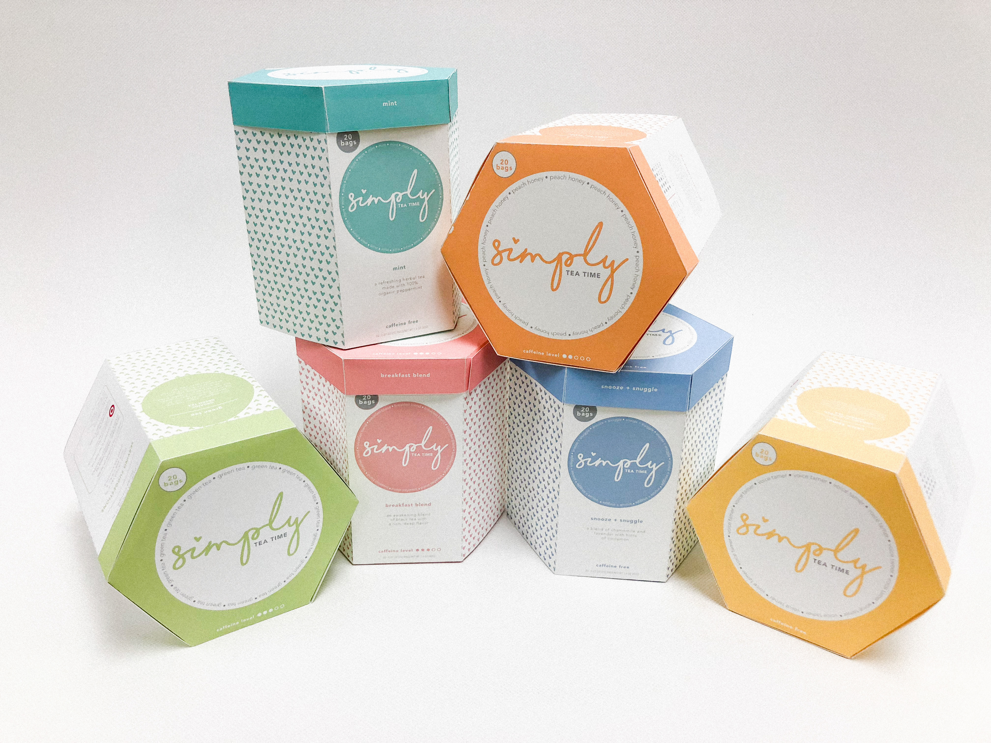
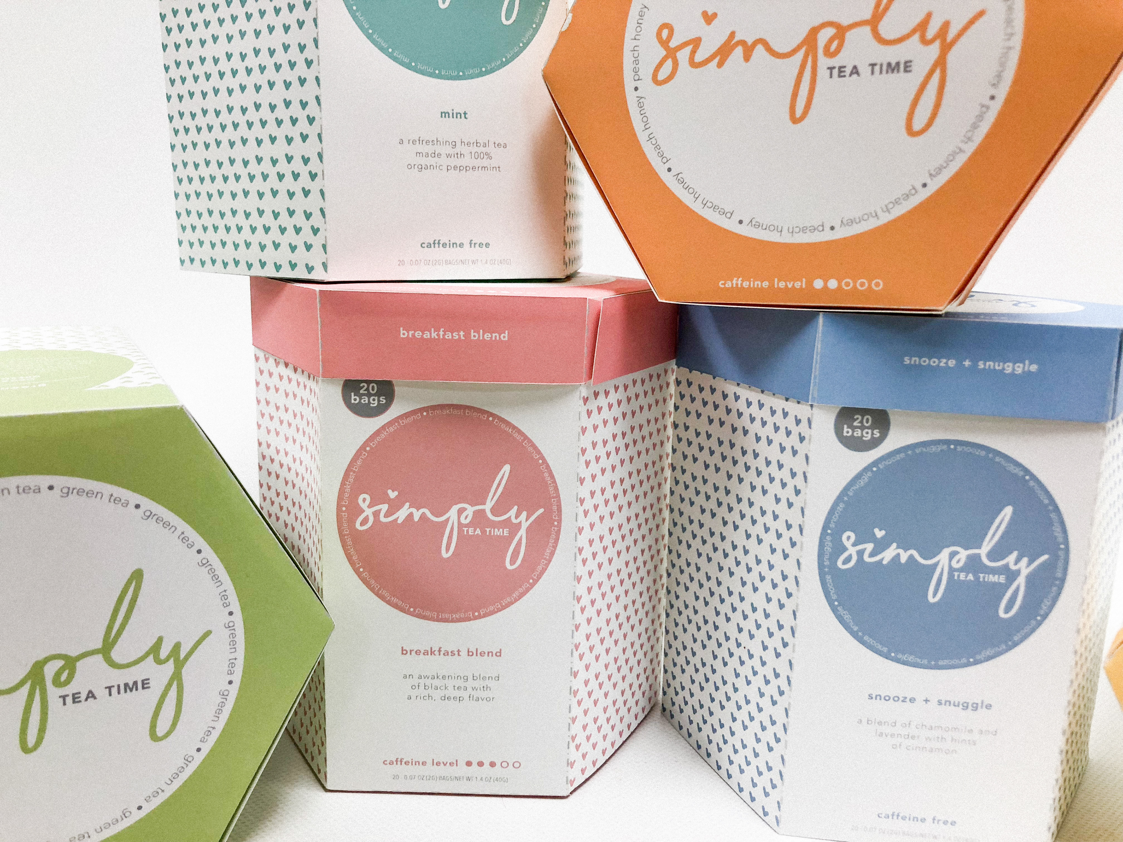
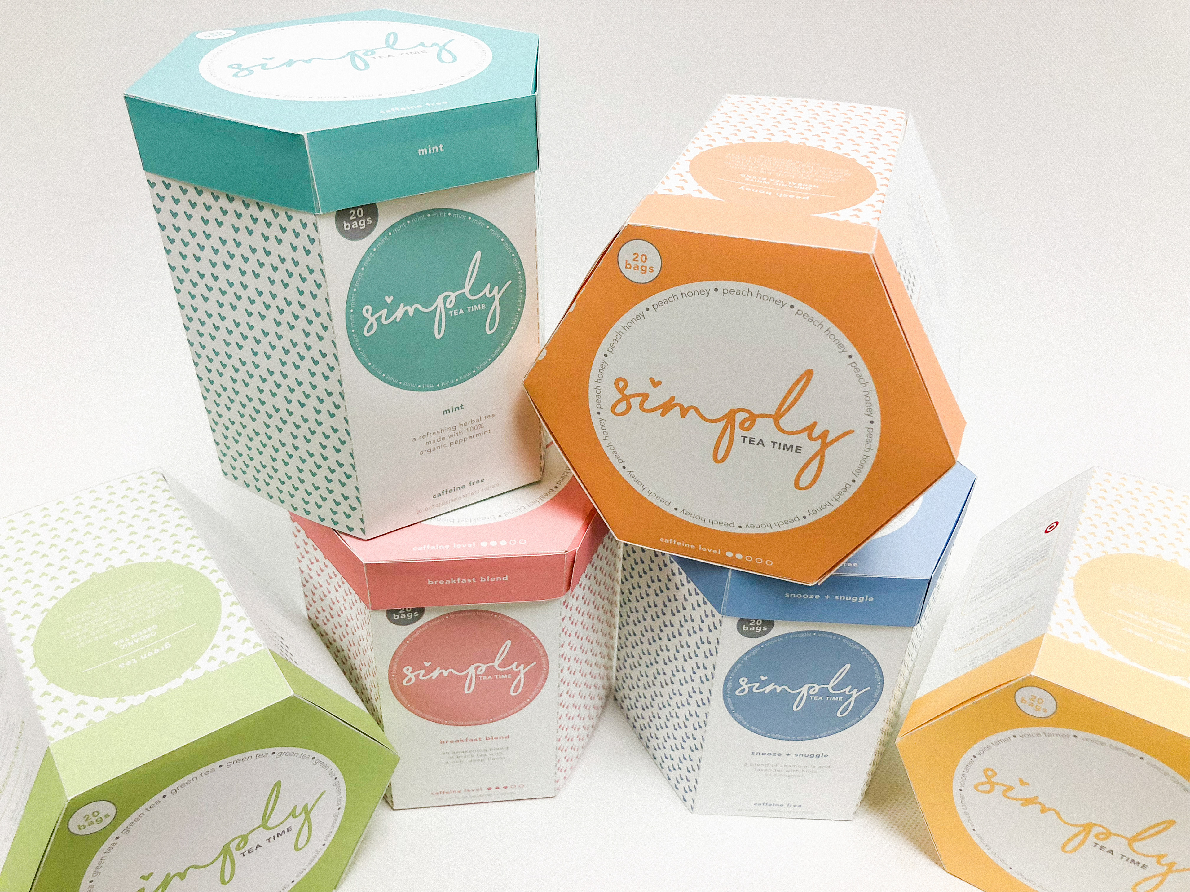
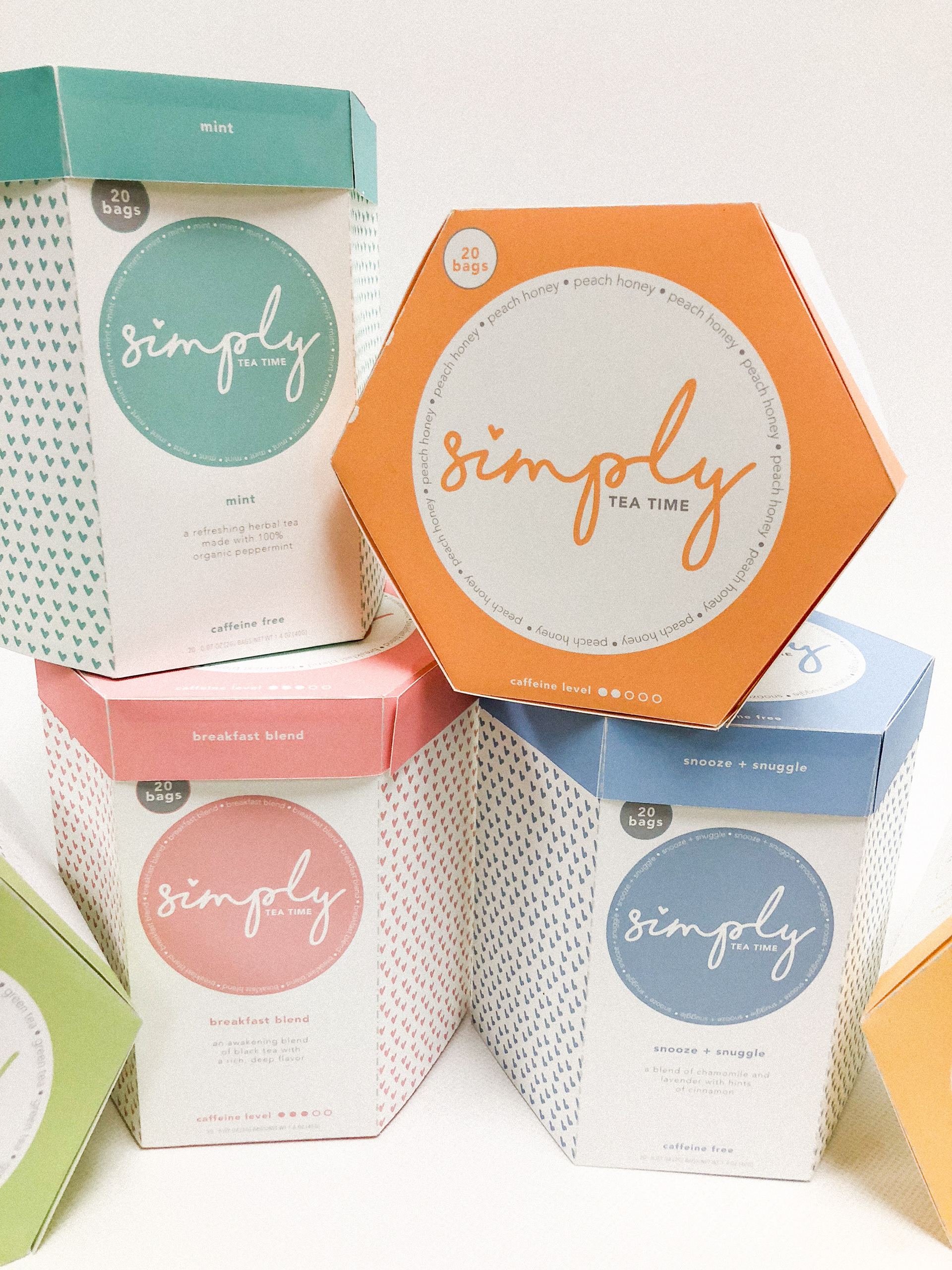
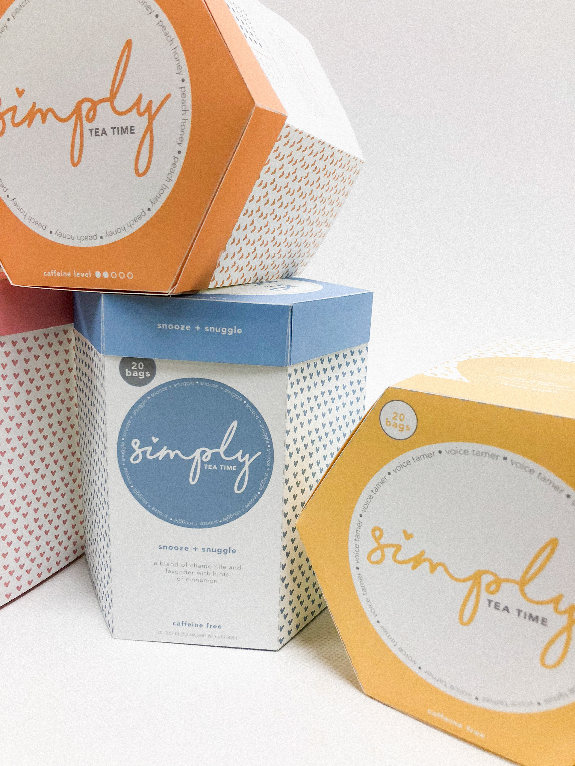
Target asked that Simply’s logo be changed from the old type choices from Simply Balanced’s logo to something completely new, and more directed at a college-aged female demographic. The trial run of this design change was to be applied to Simply’s tea packaging. Creative freedom was given for the shape and size of the packaging itself, but Target’s main request was that each flavor in the tea line be differentiated through the use of different colors, along with the flavor listed.
The Design:
Color was to be the main differentiating factor between all flavors in Simply’s tea line. Each of the six tea flavors is separate from one another by the color that is showcased on its tin, besides the apparent flavor name on the tin. Though Target packages Simply’s tea in tea bags, it was decided to go in the direction of tea cans, as if it was loose leaf tea to give it a little bit more of and “upscale” feel. The logo for Simply is done in a handwritten, lowercase style, with the dot over the “i” as a heart, to keep that fun, juvenile aspect alive. The heart from the “i” is also brought into the background pattern in the color that is associated with that flavor of tea, to continue that element, as well as the flavor’s designated color. Besides the label, the only element that showcases a large mass of solid color is the lid, also in correspondence to that flavor’s color.
Student work completed at Chapman University.