

the brand.
"Lemonade is a modern marketplace serving a colorful bounty of Season Food + Refreshment in a bright cafeteria setting” (lemonadela.com).The menu displays a variety of dishes that have various influences from cultures throughout the world and center mainly around different vegetables. The menu changes due to the seasonal freshness of the ingredients used in Lemonade’s dishes several times throughout the year and are simple plates with big flavor. Lemonade is a California based company that balances eating healthy with indulging in sweetness and bring in the culture of the West Coast through their company environment and the tastes of their foods.
the goal.
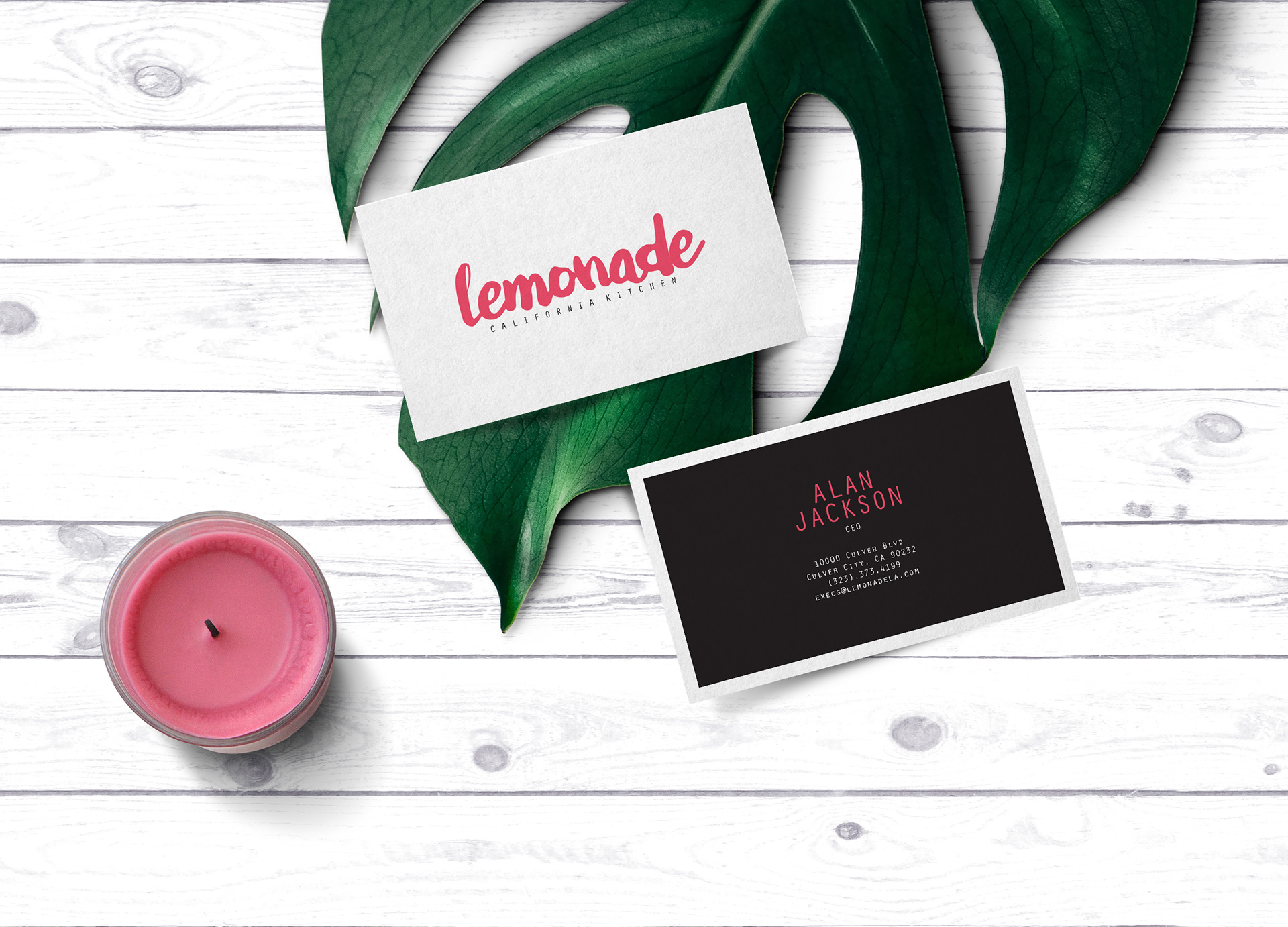
The goal for this project was to create an updated logo for Lemonade using only typographic elements that would be used as the company’s new brand identity for advertising and on corporate documents. The logo would also be tailored to a fresh, new design for a company letterhead, business card, and envelope.
the design.
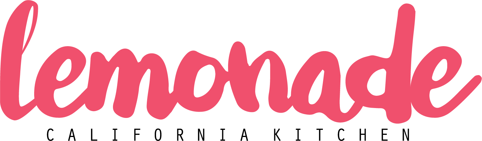
The logo has "Lemonade" in all lower-case letters to keep with the original logo design idea, but changing the font to a fun, thick, youthful handwriting look with a bit more personality. It is paired with a simple font in a spaced out uppercase to keep the logo remaining simple. Colors are meant to stray away from the typical yellow that is associated with lemons and lemonade and to bring in a cool color scheme for the main logo with a teal, green-blue hue as the main logo color, and secondary logo options in a pink and a yellow for personalized and additional use.